Visualization of COVID rates in AZ Counties
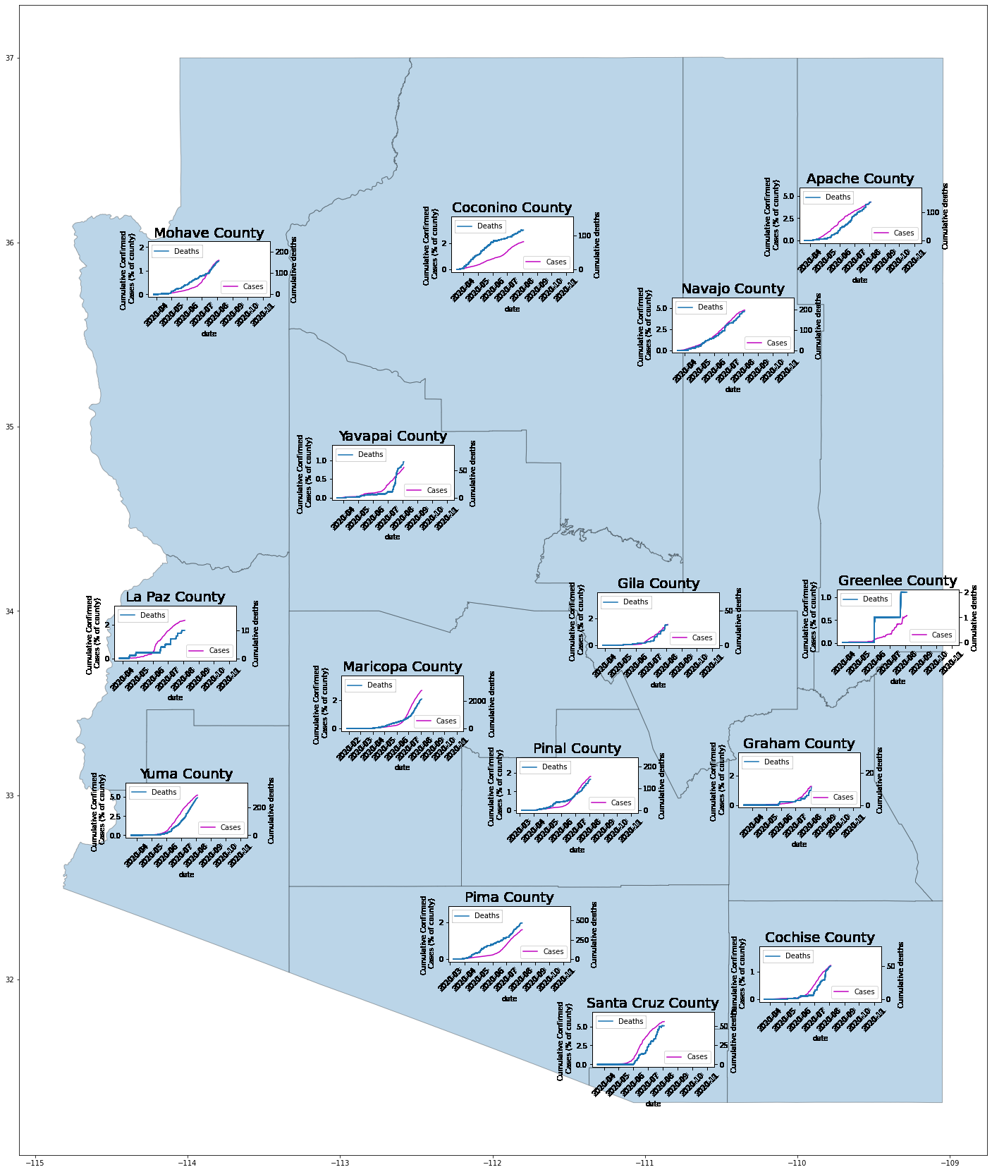
In this post, I will be creating a visualization of the impact of COVID in Arizona counties. To be more precise, I will be overlaying graphs of the percentage of cumulative confirmed cases of COVID and the cumulative number of COVID-related deaths in relation to each county in Arizona.
This COVID-19 visualization project began primarily as a relevant way to practice my programming skills. As COVID was still a relatively unknown disease, I started mapping out the positive COVID rates and death rates in each county in Arizona, where a graph of these rates is laid over a map of the counties. There are many more far better websites that allow you to personalize the type of COVID visualizations you want to see for the country, state, or county of your choosing, such as Covid Act Now, in comparison to my rather crude graphs. Nonetheless, this project was good exercise in building my coding intuition in for when I first started learning Python.
Loading the data
To begin, we will first load the necessary packages and data to create our visualizations. I downloaded my data using an API (Application Programming Interface) from the Covid Act Now organization which was in a JSON (JavaScript Object Notation) format.
This is an example of what this data looks like in JSON format:
{"countryName": "US", "fips": "04001", "lat": null, "long": null, "stateName": "Arizona", "countyName": "Apache County", "lastUpdatedDate": "2020-11-05", "projections": null, "actuals": {"population": 71887, "intervention": "STRONG_INTERVENTION", "cumulativeConfirmedCases": 4043, "cumulativePositiveTests": null, "cumulativeNegativeTests": null, "cumulativeDeaths": 178, "hospitalBeds": {"capacity": 234, "totalCapacity": 162, "currentUsageCovid": null, "currentUsageTotal": null, "typicalUsageRate": 0.3}, "ICUBeds": {"capacity": 0, "totalCapacity": 0, "currentUsageCovid": null, "currentUsageTotal": null, "typicalUsageRate": null}, "contactTracers": null}, "metrics": {"testPositivityRatio": 0.057999999999999996, "testPositivityRatioDetails": {"source": "CMSTesting"}, "caseDensity": 23.84695027314694, "contactTracerCapacityRatio": null, "infectionRate": 1.03229330279, "infectionRateCI90": 0.4041464553399998, "icuHeadroomRatio": null, "icuHeadroomDetails": {"currentIcuCovid": 2, "currentIcuCovidMethod": "estimated", "currentIcuNonCovid": 0, "currentIcuNonCovidMethod": "estimated_from_typical_utilization"}}, "population": 71887, "timeseries": [], "actualsTimeseries": [{"population": 71887, "intervention": "STRONG_INTERVENTION", "cumulativeConfirmedCases": null, "cumulativePositiveTests": null, "cumulativeNegativeTests": null, "cumulativeDeaths": null, "hospitalBeds": {"capacity": null, "totalCapacity": null, "currentUsageCovid": null, "currentUsageTotal": null, "typicalUsageRate": null}, "ICUBeds": {"capacity": null, "totalCapacity": n
This is from Covid Act Now’s first version of API (API V1), which stopped updating on October 5th of 2020. Their V2 seems to be more organized and comprehensive than their first version. For this post, I will be sticking with the first version for simplicity’s sake, but the code can be easily tweaked to accommodate the second version.
To load the necessary packages we will need, we have:
import requests
import json
import pandas as pd
import geopandas as gpd
import numpy as np
import matplotlib.pyplot as plt

from tqdm import tqdm
While the package tqdm is not necessary, it is surprisingly helpful; it makes loops show a smart progress meter, which is helpful because it takes quite a while to compile all of the county COVID data into a map.
Creating the metadata
The API URL that we will be using to access this information is:
https://data.covidactnow.org/latest/us/counties/{fips number here}.OBSERVED_INTERVENTION.timeseries.json
As long as we have the FIPS codes of the counties we want (in this case, all 15 counties in Arizona), we can input that number into that URL and pull the necessary data.
So, we should create a list of the county FIPS codes we need. We should also take care to a dictionary of our metadata that includes our FIPS code, when the data was last updated, the county name, and the population of that county:
county_fips = ['04001', '04003', '04005', '04007', '04009', '04011', '04012', '04013', '04015', '04017', '04019', '04021', '04023', '04025', '04027']

county_df = df

my_dict = {}
meta_dict = {}
We don’t want to hard code the URL that we will need for each county, so we can loop through the list of county FIPS with the following code to create our metadata:
base_api_url_start = 'https://data.covidactnow.org/latest/us/counties/'
base_api_url_end   = '.OBSERVED_INTERVENTION.timeseries.json'

for i,fips in enumerate(county_fips):

    new_url = base_api_url_start + fips + base_api_url_end
    county_request = requests.get(new_url)
    county_data    = county_request.json()
    county_dictionary = json.dumps(county_data, indent = 5)

    df = pd.DataFrame(county_data['actualsTimeseries'])
    df = df.set_index('date')
    my_dict[fips]= df
    meta_dict[fips] = {
                 'lastUpdatedDate':county_data['lastUpdatedDate'],
                 'countyName':county_data['countyName'],
                 'population':county_data['population']}
Now that we have created our dictionary of metadata, we can move onto creating our map of COVID data.
Creating the county map
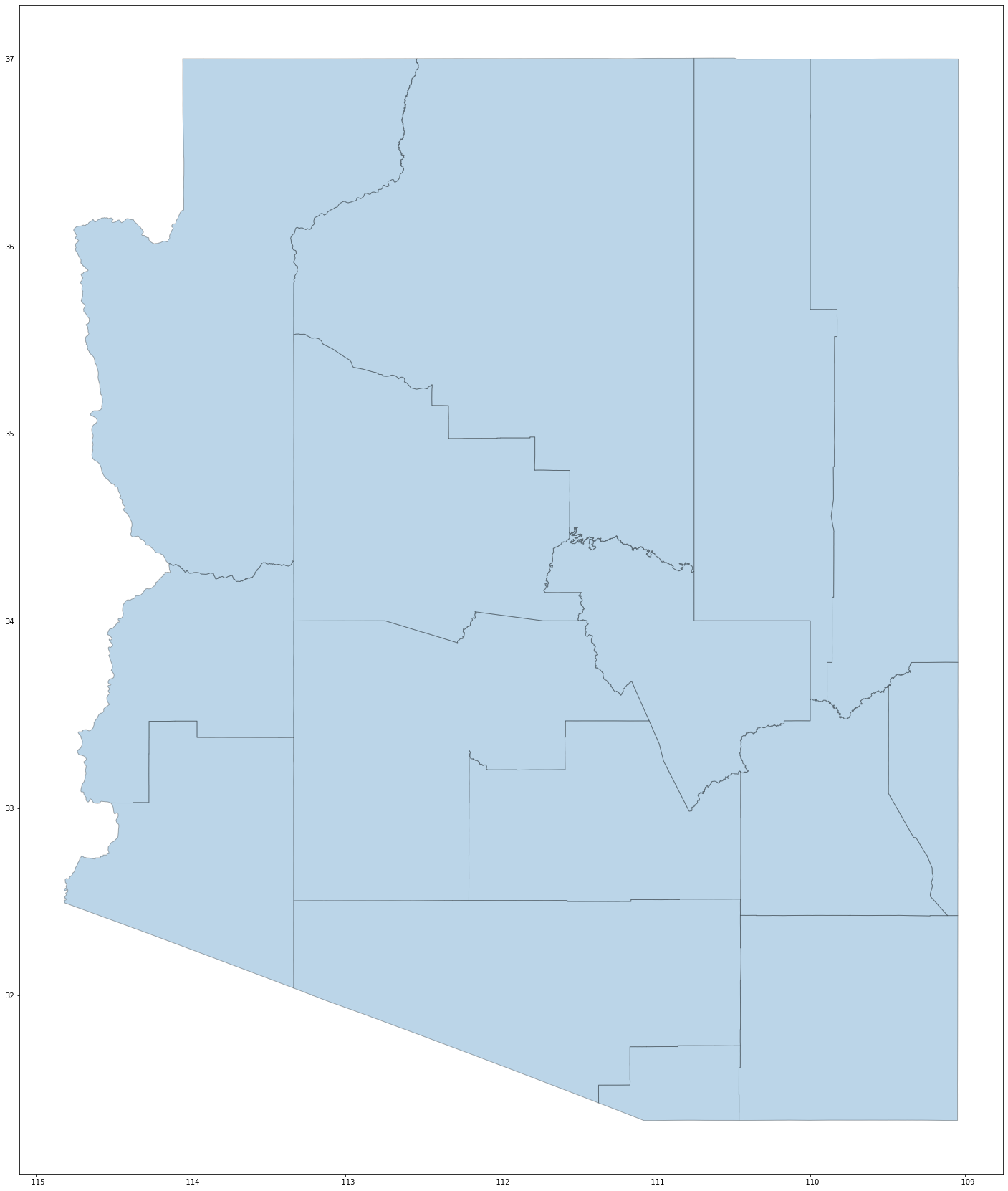
First, we need a map of the counties in Arizona, which I downloaded from the census bureau. The following code prints out a map of Arizona with its counties clearly delineated.
filepath = './tl_2016_us_county/tl_2016_us_county.shp'
gdf = gpd.read_file(filepath)
gdf['centroid'] = gdf.centroid
gdf = gdf.set_index('GEOID')
az_counties = gdf[gdf['STATEFP'] == '04']

az_counties.plot(figsize = (30,30), edgecolor = 'k', alpha = 0.3)
ax = plt.gca()
transform = ax.transData
This is what results: 
Based on the automatic placement of the graphs on the map, the centering of the Apache and Greenlee counties is slightly awkward, so we can customize the offset these graphs in these specific counties. Here, I’ve chosen a horizontal offset of -0.5. This will be used in the following for-loop:
fips_to_adjust = ['04001', '04011']

horizontal_offset = -0.5
Creating the final visualization
Finally, we can write a for loop that iterates through each FIPS code (and thus, each county), to create our final visualization:
for n in tqdm(range(200)):
    for fips in my_dict.keys():
        point = az_counties.loc[fips]['centroid']
        longitude = point.x
        latitude = point.y

        # this segment of code adjusts the alignment of the graphs in the aforementioned counties
        if fips in fips_to_adjust:
            offset = 0.6
        else:
            offset = 0
        county_ax = ax.inset_axes([longitude + horizontal_offset, latitude + offset, 0.8, 0.3], transform = transform )


        df = my_dict[fips]
        dt_index = pd.DatetimeIndex(df.index)

        N = meta_dict[fips]['population']

        dt_start = dt_index[0:n]
        dt_end   = dt_index[n:]

        cases_normalized = df['cumulativeConfirmedCases'].values/N *100

        cases_start = cases_normalized[0:n]
        cases_end   = cases_normalized[n:]

        deaths_normalized = df['cumulativeDeaths']

        deaths_start = deaths_normalized[0:n]
        deaths_end   = deaths_normalized[n:]

        county_ax.plot(dt_start,cases_start,color='m',label='Cases')
        county_ax.plot(dt_end,cases_end,color='w',alpha=0.0)

        county_ax.set_title(meta_dict[fips]['countyName'], fontsize = 20)

        xticklabels = county_ax.get_xticklabels()
        county_ax.set_xticklabels(xticklabels, rotation = 45)

        county_ax.set_xlabel('date', fontsize = 10)
        county_ax.set_ylabel('Cumulative Confirmed \n Cases (% of county)', fontsize = 10)
        county_ax.legend(loc='lower right')

        ax2 = county_ax.twinx()
        ax2.plot(dt_start, deaths_start, label='Deaths')
        ax2.plot(dt_end, deaths_end, color = 'w', alpha = 0.0)
        ax2.set_ylabel('Cumulative deaths', fontsize = 10)
        ax2.legend(loc='upper left')
Below is a picture of the resulting graph which shows data up until late July of 2020. To plot further along into 2020, simply increase the number in the tqdm(iterable). 
